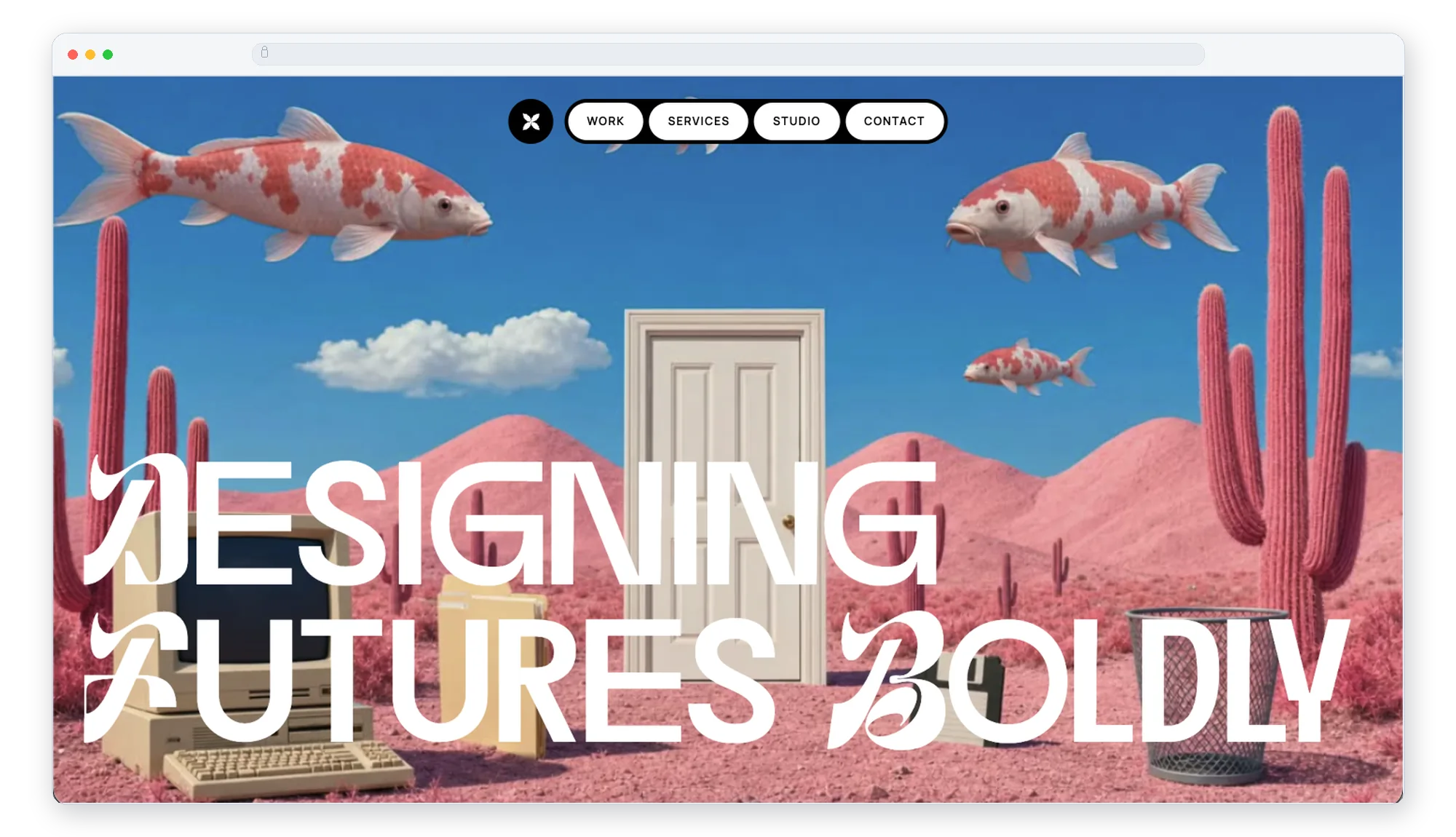
A scroll-driven landing page for VibeAlong, built during the AI Prototyping course at Maven. The brief was really a study of motion: which library or technique fits which kind of task. Scrolling plays a surreal desert scene, the headline dissolves letter by letter, and a frosted-glass About panel rises into place. Along the way I learned that preparing the video and the type matters as much as the animation code.
What I built
- Scroll-driven background: the scene plays forward as you scroll down and rewinds as you scroll up, frame by frame.
- Headline dissolve: "Designing Futures Boldly" fades, drifts down, and compresses one letter at a time, following the scroll.
- Parallax and tilt: the background drifts gently away from the cursor, and the glass panel tilts toward it in 3D, both easing with a slight lag so they feel like physical objects.
- Frosted-glass About panel: it rises from below the screen as you near the bottom of the page and stays in place.
- Client marquee: a row of names that scrolls at a steady speed and loops with no visible seam.
- Navigation: a centred, fixed nav whose four-petal logo spins once when you hover it.
Choosing the right tool
The core of the project was matching each motion task to the tool that handles it best, rather than reaching for one library for everything.
- GSAP and ScrollTrigger for anything tied to scroll: the background frames, the headline dissolve, and the panel rising into place. Scrubbing animations against the scroll position, in both directions, is what GSAP is crafted for.
- GSAP for pointer-following parallax too. Its quick tweens chase a moving target smoothly, which gives the background drift and the panel tilt their slight, natural lag.
- Motion for UI interactions. The logo spin is a few declarative props on the button (a resting state and a hover state), which suits small, state-based micro-interactions.
- Plain CSS for steady, endless loops. The marquee is a single keyframe animation over two identical halves, so it needs no JavaScript at all.
Prepping the files
Most of the polish came from preparing the assets before animating them.
- Video: my first version scrubbed the video directly, but the file had a single keyframe, so every seek decoded from the start and scrolling backwards stuttered. Re-encoding it with a keyframe every few frames helped, and I then moved to the more reliable approach: extracting it with ffmpeg into 241 still frames, preloading them behind a loading percentage, and drawing the frame that matches the scroll onto a canvas.
- Image size: 1280px frames looked clean full-screen at about half the download of 1920px ones (19 MB instead of 34 MB).
- Typography: to animate the headline per letter, each letter needs its own element. Splitting the text that way silently drops the font's kerning, which shifted letters by up to 28px, so the page measures the unsplit text and restores each letter to within a fraction of a pixel. Screen readers still hear one heading, not 22 letters.
- Fonts: Manrope and Instrument Serif from Google Fonts, and the Dirtyline display face self-hosted from its web font file.
What I learned
- There's no single best motion library. Scroll-tied, state-based, and endlessly looping motion each have a natural home.
- Subtle numbers read as premium: a 30px parallax shift and a 6° tilt feel physical, while larger values start to feel like effects.
- Asset prep is part of the animation. Keyframes, frame size, and kerning decided how smooth the result felt more than any easing curve did.
- Check every breakpoint. The nav overflowed on the narrowest phones and overlapped the panel on a phone held sideways, which I only caught by measuring at a range of screen sizes.
Toolkit
- Framework: React 19, Vite, TypeScript, Tailwind CSS v4.
- Motion: GSAP with ScrollTrigger, Motion, and CSS keyframes.
- Asset prep: ffmpeg for frame extraction.
- Prototyping: Claude Code.
- Hosting: GitHub and Vercel.